

Light backgrounds
The charcoal-and-green wordmark is intended for white, pale gray, or other light surfaces.
/brand/tabgrid-logo-light.pngTabgrid brand kit
Use the official wordmarks and icon consistently across the website, product UI, favicons, and shared materials.
The charcoal-and-green wordmark is intended for white, pale gray, or other light surfaces.
/brand/tabgrid-logo-light.png
The light wordmark keeps its contrast on graphite surfaces. Do not recolor or add effects.
/brand/tabgrid-logo-dark.pngCore palette
The product UI's near-black surfaces, restrained gray dividers, and vivid green action color inform the marketing site. Keep green for emphasis and actions; let neutral surfaces carry most content.
How to use
<img
  src="/brand/tabgrid-logo-light-sm.png"
  alt="Tabgrid"
  width="320"
  height="94"
>
Choose the light or dark wordmark to match its background. The -sm files are 320 px wide and suit headers, footers, and other small placements; use the full-resolution files for large or downloadable artwork. Use the icon, not a wordmark, in compact square spaces.
<link rel="icon" href="/favicon.ico" type="image/x-icon">
<link rel="icon" href="/brand/favicon-white-32.png" sizes="32x32">
<link rel="apple-touch-icon" href="/brand/favicon-white-180.png" sizes="180x180">
These are the same favicon assets used by tabgrid-ui. The web app switches between the white mark in dark mode and the green mark in light mode; favicon.ico is the browser fallback.
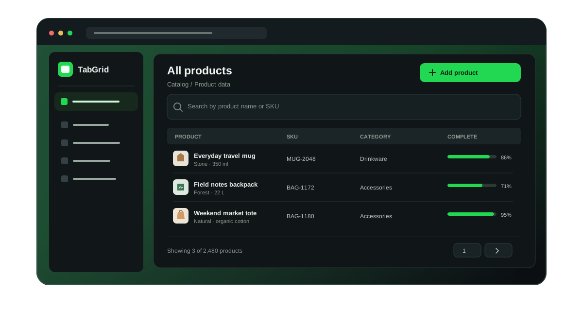
The PNG wordmarks are source artwork copied from tabgrid_logo_assets. The favicon assets come directly from tabgrid-ui/public/. The catalog preview is an original illustration for this website. Keep images in public/ so they are served at their documented root-relative URLs.